01 SPACE & STRUCTURE
Godot UI layout,
without the guesswork.
A window gets smaller. A label gets longer. Your menu should still have a place for everything.
Anchor the outer frame. Let containers arrange the contents. If a Control is a container’s immediate child, dragging it into place is not a durable layout rule. The next layout pass can move it back.
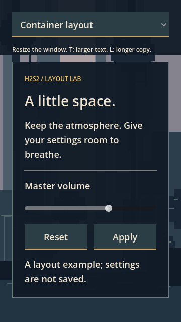
For this settings panel, a full-rect frame follows the viewport. A MarginContainer provides the breathing room, a VBoxContainer stacks the content, and an HBoxContainer shares the action row. Text can wrap. Taller content can scroll. No script calculates the buttons’ positions.
Anchors and containers solve different parts of the same problem. An anchor describes an edge relative to its parent; an offset adds a distance from that anchor. A container assigns its children rectangles according to their minimum sizes and sizing flags. Godot’s anchor guide and container guide explain those rules.
Same contents. Different rules.
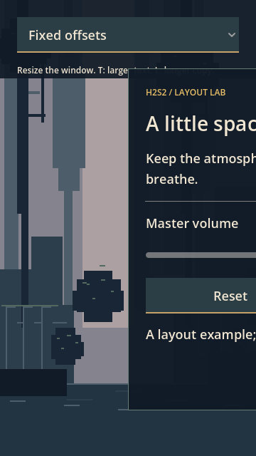
Switch to fixed offsets, then narrow the viewport. The panel keeps its old rectangle and loses its right edge. Switch back: the parent allocates a new width and the panel’s contents use it.
LAYOUT LAB / INTERACTIVE MODEL
Animated browser illustration, not an embedded Godot renderer. Motion makes the changing relationships easier to follow; the native demo does not tween its layout passes. Pause motion above, or use your system’s reduced-motion setting. The controls also work without automatic resizing.
The parent allocates the width. The children fit their assigned space.
Give each level one job.
Download the project to inspect the complete scene in Godot. Here is the corrected branch; the separate intentionally broken branch is just for comparison.
LayoutLab (Control)
└─ Frame (MarginContainer)
   └─ Stack (VBoxContainer)
      ├─ Mode (OptionButton)
      ├─ Hint (Label)
      └─ Scroll (ScrollContainer)
         └─ SettingsPanel (instance)
            └─ Padding (MarginContainer)
               └─ Content (VBoxContainer)
                  ├─ Kicker / Title
                  ├─ Description / Divider
                  ├─ VolumeLabel / Volume
                  ├─ Actions (HBoxContainer)
                  │  ├─ Reset
                  │  └─ Apply
                  └─ Status
FOLLOW THE OWNERSHIP
The viewport sizes the root. The frame makes an inset. The stack allocates height. The panel owns its internal composition.
SettingsPanel is a saved scene. It inherits the host’s theme without reaching up the tree for a particular parent name.
1. Anchor the outside, then inset the inside.
Set the root Control and its Frame to Layout → Full Rect, with zero offsets. Frame is a child of a plain Control, so anchors are appropriate here. Full Rect means its right and bottom anchors are 1.0, while left and top remain 0.0.
On Frame, set Theme Overrides → Constants: all four margins to 24. These are container padding constants; they are not anchor offsets. Children inside Frame are arranged by Frame.
# Equivalent to the saved Inspector settings, on LayoutLab:
func _ready() -> void:
    var frame: MarginContainer = $Frame
    frame.set_anchors_and_offsets_preset(Control.PRESET_FULL_RECT)
    for edge in ["left", "top", "right", "bottom"]:
        frame.add_theme_constant_override("margin_" + edge, 24)
2. Stack the controls. Give height an escape route.
Add Stack inside Frame, then Mode, Hint and Scroll inside Stack. Set Stack’s separation to 16. Give Scroll Vertical → Expand + Fill so it takes the space left after the selector and hint. Set Horizontal Scroll Mode → Disabled; leave vertical scrolling automatic.
Scroll has one direct child: the SettingsPanel instance. Give that panel Horizontal → Expand + Fill. Its width follows the available area. When longer text needs more height than the viewport provides, use the vertical scrollbar instead of shrinking every glyph.
3. Make the panel a self-contained scene.
Save a PanelContainer as settings_panel.tscn. Put Padding inside it with four 24 margin constants, then Content with a 16 vertical separation. The panel’s border has its own small style-box contribution, so a measured inner width need not equal “window minus 96.”
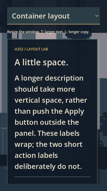
Add the labels, slider, action row and status label shown above. On the title, description, volume label and status label, set Autowrap Mode → Word Smart. The short action labels in this demo deliberately remain on one line.
4. Ask both action buttons to share the row.
Set Actions’ separation to 12. On both Reset and Apply, enable Horizontal → Expand + Fill. Equal stretch ratios and the matching button styles give this example equally sized actions. Expand participates in spare-space allocation; Fill uses the allocated rectangle.
# In a method on LayoutLab; the download stores these in the scene.
var panel: PanelContainer = $Frame/Stack/Scroll/SettingsPanel
var actions: HBoxContainer = panel.get_node("Padding/Content/Actions")
for button in actions.get_children():
    button.size_flags_horizontal = Control.SIZE_EXPAND_FILL
actions.add_theme_constant_override("separation", 12)
Try moving Reset manually, then resize the window. Its container will arrange it again. Change the row’s sizing rules or introduce another wrapper when you need a different relationship; don’t fight the next sort pass.
5. Keep the theme separate from the structure.
The root uses studio_theme.tres. Its colors, panel border and button padding are inherited by the nested scene. The text-size toggle duplicates that theme before changing default_font_size, so another instance’s shared resource is not silently edited.
The demo script connects Reset, Apply and the comparison controls. Those signals do not calculate the panel’s layout. Reset changes an in-memory slider value; Apply updates a status label. Persistence and full input navigation belong in separate examples.
A container cannot make a word smaller.
During the first test run, our mode selector had a long comparison label. At theme font size 24 it pushed the narrow layout wider than the viewport. The panel’s container flags were correct; a different control was asking for too much space.
We shortened the selector labels and disabled its fit_to_longest_item behavior. Neither change removes a real minimum-size requirement. When your own translated labels no longer fit, choose a design response: a different row arrangement, wrapping where the control supports it, more vertical room, or a supported minimum viewport.
WHEN YOUR CONTROL “IGNORES” THE LAYOUT
Check its immediate parent, its combined minimum size, text wrapping, theme padding and sizing flags. Then inspect the same chain one level higher. A parent can be too wide because of a sibling you weren’t looking at.
This example supports widths of 360 and 840 at the tested text variants. It does not claim that an HBox automatically becomes a VBox, that all translations fit, or that changing window size scales the font. Logical viewport sizing and high-DPI presentation are separate concerns.
The small window is the useful test.
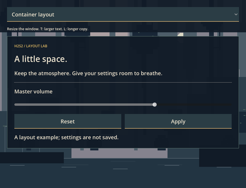
These are unedited viewport captures from the downloadable project, rendered in Godot 4.7.2.stable.official.ed1daf0bf on macOS using the Compatibility/OpenGL renderer. They are not illustrations or generated game imagery.
See the wide window and larger-text captures
| Variable | Checked values | Assertion |
|---|---|---|
| Viewport width | 360 / 840; height 640 | Panel remains inside horizontal margins |
| Theme font size | 18 / 24 | Action widths respect their minimum sizes |
| Description | Short / longer copy | Content stays within panel width |
| Panel reuse | Original / fresh subscene instance | Same layout assertions after replacement |
Eight width/text combinations, repeated after replacing the panel, produced 16 passing geometry cases. Separate assertions verified that the fixed version overflows at 360 and that a container sort restores a manually displaced action button. Geometry checks ran headlessly; the images required a display-backed renderer.
A small project, with the seams showing.
GODOT 4.7.2 / MIT-LICENSED EXAMPLE
Scenes, theme, script, tests and capture helper.
No plugins or third-party game assets.
- Extract the archive and import
project.godotin Godot 4.7.2. - Press F5, resize the window and compare the two modes.
- Press T for larger text and L for longer description copy.
- Open
settings_panel.tscn, change a margin or a label, and repeat the narrow-window check.
# From the extracted project directory:
godot --headless --path . --import
godot --headless --path . --script res://test_layout.gd -- geometry.json
The archive is built reproducibly from the reviewed demo source. Its SHA-256 and the geometry receipt are in the evidence manifest. Code/theme: MIT, H2S2 Studio. The example is not Mithraeum’s production interface.
Godot UI questions, answered directly.
Why do my Godot Controls move back after resizing?
A container owns its immediate Control children’s rectangles. A resize or another layout pass can replace a child’s manual position. Change the container’s layout rules, the child’s sizing flags, or the scene structure. In this demo, a forced container sort restores a manually moved button.
Should I use anchors or containers for responsive UI?
Use anchors for a Control whose edges should follow its parent, such as the outer full-rect frame. Use containers to arrange groups of children inside that frame. The two approaches work together; do not use manual offsets to fight a container’s allocation.
Why does my Godot UI overflow even with Expand enabled?
Expand does not cancel minimum sizes. Long text, theme padding, or a sibling can ask the parent for more space than the viewport provides. Inspect the minimum-size chain, then choose wrapping, a different arrangement, scrolling, or a supported minimum viewport. The Journal shows the selector failure we encountered.
Does resizing the window automatically scale the font?
Not in this project: viewport stretching is disabled. Resizing changes available layout space, while the T key separately switches the theme font size. The larger-text test uses wrapping and vertical scrolling. Other stretch configurations are a separate design choice.
Where to go one level deeper.
- Godot 4.7: Size and anchors — parent-relative edges and offsets.
- Godot 4.7: Using Containers — container ownership and sizing options.
- Control reference, ScrollContainer reference and OptionButton reference — minimum sizes, scrolling and selector sizing.
This is a focused layout experiment. Other engines/platforms/renderers, safe areas, localization coverage, controller focus and a full accessibility audit are outside the verified scope. The browser model illustrates relationships; the project and captures establish the native result.
Prepared for H2S2 Studio with Codex. Automated technical checks and capture inspection: November 2, 2026. Technical review information and evidence are recorded above.
REFERENCE THIS FIELD NOTE
Link to the original experiment: h2s2studio.com/guides/ui-layout/. For a specific explanation, use a section link such as why Expand does not remove minimum sizes.
The downloadable project is MIT licensed. Keep its license with reused code. The Journal explains the design decisions; About H2S2 identifies the studio behind the work.